Saturday, November 15, 2014
Nike does it again
In the Nike ad, displayed in Launching the Imagination, Nike advertisers appeal to many audiences through the use of humor and motivation (338). A man of 80 years old is pictured running. The words say, "I run 17 miles every morning. People ask me how I keep my teeth from chattering in the wintertime. I leave them in my locker." The ad appeals to young audiences in showing them that if an 80 year old can continue running, even at his age, then exercising should be no problem for them as they are younger and should be able to handle at least the 17 miles the 80 year old accomplishes daily. On the other hand, this also appeals to the older generation because it would convince them to try some kind of physical exercise again. Well played, Nike.
Emotion that transcends time
The painting, Oath of the Haratii, by Jacques-Louis David that was painted in 1784 captured audiences when it was first shown and it is still being talked about today. The play on light and darkness enhances the emotion behind the event that is happening. On the left side, the background is dark, which plays into the idea that these three men are going into battle and may not return. The right side of the picture has a lighter background which highlights the three wives and two children of these three men. This is clearly a piece meant to evoke strong emotion about the idea that no one loses on the battlefield. Such a great piece, especially considering that Veteran's Day was celebrated this past week.

Saturday, November 8, 2014
Sculptured beauty, ugly message
The sculpture, Perseus and Medusa, by Benvenuto Ceillini is a depiction of the slaying of Medusa (269). The skill behind the sculpture and attention to detail makes the viewer want to take a closer look, but when they do, they make get more than expected. At first glance, the sculpture looks like a portrayal of a warrior that has some sort of victory in a battle. When looking closer, the viewer will realize that the warrior is standing upon the body of a female while holding her head in his left hand. The title tells the onlooker that this is a gruesome scene of Perseus defeating Medusa and victoriously holding her head out to show his prowess.

From natural to unnatural
Wood is a natural resource. When this resource is cut and shaped in order to make buildings, it becomes unnatural, to an extent. Nature has a way of taking over and shaping its surrounds to fit the purpose it serves. The sculpture, Tetra House N-3, W26 Project, by Tadashi Kawamata (262) could be seen as an interpretation of nature (wood) being cut and shaped to meet the purpose of potential builders, but rather than creating a functional structure, the domesticated wood has been utilized by Kawamata to create art. The reason this is interesting is because the wood started out naturally, was touched by humans and re-purposed for domesticated purposes, but then used to take over and obstruct a building. This is a synthetic version, created by Kawamata, of what nature can do to structures that are not tended to. In time, nature finds a way to take over and reclaim what once belonged to it.

Saturday, November 1, 2014
Poop as Art
In chapter 11 of Launching the Imagination, nature in art is discussed. One such piece is titled "Dung Beetle Pendant Brooch" by John Paul Miller. The dung beetle is typically thought of as an insect that rolls the fecal matter of other species for a living. That Miller could transform such a menial task into a piece of art is very interesting.

Lighting
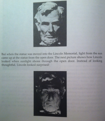
Chapter 9 in Launching the Imagination holds a wealth of information on lighting. While many of the techniques that are discussed cover the medium of sculptures, this could also be applicable to computer based art, paintings, and photographs. For example, one would want to be conscientious of light placement when putting together artwork such as a photomontage on the computer. Paintings and photographs are also important areas to be aware of lighting. This is because the light source can contribute or take away from a piece of art. An example of this in a sculpture is figure 9.53, "Head of Abraham Lincoln" by Daniel Chester French. Below is a similar idea:
Saturday, October 25, 2014
The Kiss
I find the sculpture, The Kiss, by Auguste Rodin to be very interesting. The lighting makes such a huge difference. In figure 9.10 A, in the book, "Launching the Imagination", the shadows both highlight and hide certain characteristics of the marble sculpture, which leaves some of the sculpture up to the imagination for the viewer. If the viewer was to take a step back from this sculpture, it may seem lifelike enough to make the viewer take a second glance to ensure that this scene was not actually playing out. The artist did a great job of depicting a couple of lovers lost in the moment.

Eat Clean or Die Dirty
I recently made a propaganda piece that features a strong message about properly fueling one's body. The text reads "Eat Clean Or Die Dirty". This is a strong message, but the intention was to stir up the audience and receive strong reactions. Society today is focused on instant gratification with the cheapest price tag, yet this is also what is ruining lives. I am a strong advocate for eating clean, working out, and going the extra mile to help other people do the same. Thus, this propaganda poster was the perfect outlet to do so. After making this piece, I posted it on my health and fitness page and it received quite a bit of positive feedback.

Saturday, October 18, 2014
Hybridity
According to Launching the Imagination, by Mary Stewart, hybridity "may be defined as the creation of artworks using disparate media and meaning to create a unified conceptual statement." With all of the shapes in the painting of I wish I could help you, by Daniel Sutherland (1994, oil on canvas on wood with hardware), the mind is constantly trying to familiarize itself with what is going in the painting. It is somewhat like the vagueness principle where the mind makes connections even when a full description is not given. Regardless of what the shapes are, the mind will try to fit them into categories that are known rather than keeping them in the unknown. The reason this is relative to artwork I may produce is because it helps to open my mind as to what art can be and that is makes a piece more interesting when there are unknowns involved. The unknown allows the mind of the audience to be creative, ponder, and try to figure out what the creator of the piece is trying to convey.
(Picture unavailable online.)
(Picture unavailable online.)
Iconography
According to the book, Launching the Imagination, by Mary Stewart, Iconography "is the study of such symbolic visual images", or it is the description of images (159). While looking at the image title The Serpent Didn't Lie, by Deborah Haylor-Mcdowell (etching 1997, figure 8.3) my eyes were constantly swept in a circle but were able to stop to focus on each individual action that is creating the content of this piece. Before I read the description, I tried to decipher what each of the action pieces that mad up the photo were about. While most of my speculations were incorrect, the fact that each element of the picture held meaning was very apparent. If I were to apply this to my own work, I would say that regardless of what the personal meaning behind my work is, I would need to place emphasis where it is due in order to allow the audience to realize that there is meaning behind the work. This is why it is also important to include a description, so that after an analysis by the audience is performed, they are able to understand what the maker of the piece had in mind for it.
(I was unable to find a picture of this piece online to post here.)
(I was unable to find a picture of this piece online to post here.)
Thursday, October 9, 2014
"Perfectionism feed(s) fear"
While reading through Launching the Imagination, the mention that "Both habit and perfection feed fear" hit close to home for me (133). I have often limited my potential simply because I do not feel like what I create is worthy of being art or something that will make a difference. What if Michelangelo had told himself his work was never going to be good enough? The world would never have seen his painting at the Sistine Chapel. The work of individuals that go before us shows what humans are capable of creating through applying oneself.

OAI Vector

The patterns inside the letters are all very busy, which also contributes to the idea that I am overly ambitious, constantly busy, and have a tough time sitting for long periods of time. I kept quite a bit of negative white space within my piece to help the letters/pictures to pop. On the right side, I placed a border around the shape to draw the eye back into the other patterns rather than allowing the focus to run off the page.
Saturday, October 4, 2014
Albrecht Durer, The Knight, Death and the Devil
The texture of the engraving by Albrecht Durer, titled The Knight, Death and the Devil, 1513, caught my eye because of the layers that make up the piece (117). While the etching itself tells the story of the horrors of the Black Plague, the layers also weave in the emotions of sorrow and anxiety. These emotions perfectly capture the hopelessness that must have plagued the victims of the Black Plague. The fact that the artist could tell a story both with the picture itself and with the lines that make up this piece show extreme attention to detail and passion for the work he does.

Divergent
I enjoyed learning about "divergent thinking" within the bounds of creating a piece of art. According to Mary Stewart in Launching the Imagination, "In divergent thinking, the means determines the end. The process is more open-minded; specific results are hard to predict" (119). I relate most to this method of design in my own art because I have a difficult time coming up with an end result to my work. This means I start on a piece and then build upon it based on the feeling I receive from the piece. The finished product always tells a story, but it is the process that builds the story, not the work before beginning the piece.
Saturday, September 27, 2014
While looking through the art section in the New York Times, I couldn't help but think of the relation between figure 4.19 in Launching the Imagination Myron, Discus Thrower (diskobolos) and "Denuded" by Bruno Isakovic. While figure 4.19 uses kinesthetics, or "the science of movement" to engage the observer to make them see movement within the marble statue, Bruno Isakovic's "Denuded" is a dance, but the excerpt that is shown in this article is a snapshot of a dancer's back during a single second of her performance. While this is a single picture, the sway of the dancer's back and placement of lighting shows her movement. How interesting it is that movement can be shown both in marble and in a photo of a moment in time from a live dance.
"Denuded" by Bruno Isakovic and "Discus Thrower" by Myron


"Denuded" by Bruno Isakovic and "Discus Thrower" by Myron
Salvador Dali, Christ of St. John of the Cross
While reading through the text in Launching the Imagination, the entire section on space intrigued me. I have always enjoyed admiring art, yet I have never been able to master the creation of art myself. Figure 4.11, by Salvador Dali, name: Christ of St. John of the Cross, 1951, medium: oil on canvas, immediately caught my attention (97). The artist does a phenomenal job of creating space through the "three point perspective" (96). The technique used gives the viewer the feeling that Jesus and the cross are hovering over the earth to view the sunrise, even while enduring the pain of the cross.

Vija Celmins, Untitled (Ocean)
I found this piece to be very interesting because of the realistic image that is created by the artist, Vija Celmins (67). This image is an example of two dimensional design, yet it looks like a photograph. While this piece was made with "graphite on acrylic ground on paper", the feeling I received as an observer was that I could simply jump in this pool of water and be swept away by any waves that may hit. Although this drawing may hold the few elements of changing the "size and shape of the waves" for variation, it still draws the eye and brings a calming effect of water lapping over sand to the observer.
.jpeg)
The Passing of Time - Photomontage

The
purpose behind this photomontage was to infuse emotion into a piece that was in
the present, but still holds meaning in the past, present, and future. The
background photo was taken in Leavenworth. My husband and I were on our
honeymoon. While hiking, we couldn't help but notice what a great view we had
right in front of us. Thus, we took advantage of the opportunity to capture the
moment through the lens of a camera.
What the camera captured was a
single moment in time. With the help of Photoshop, I was able to give the
viewer a glimpse of what the scenery may have looked like in the past. I chose
to elongate and discolor some portions of the original picture. The
discoloration gave the effect of the past, while the image itself was in the
present.
The imagery I chose to use to infuse
the passing of time was not only through discoloration and elongation of the
images, but I also inserted a photo that was not originally in the main
picture. I added the man that is pictured to the left of the photo, in order to
increase the meaning within the photo. He was originally taking the photo, but
because this man is my husband, he is my past, present, and future. The effect
I tried to bring across with his photo is that he was an explorer of the hiking
trail before it became a mainstream attraction to both inhabitants and visitors
of Leavenworth.
While I am also in the photo, I
wanted to detach myself so the two people could tell a story. The female is in
the present and looking out over the beautiful landscape. Because she is in the
present, she has missed the opportunity of a relationship with the man that had
walked this trail years before her, thus she is looking past the man. The man
is looking toward her, but again his body is not positioned to properly see the
woman, even if they were in the same time dimension, neither of them would
directly see each other. It would be through their peripheral vision that they
would see each other, but again there is not a direct connection.
Thus, the passage of time is shown
between the relationship between a man and woman that share a love of this
landscape, yet are unable to share a love for each other because of the
barriers of time.
Saturday, September 13, 2014
The power of blue
In figure 2.8 in the book, "Launching the Imagination", blue is the focus of the image. The text states that the color blue holds different symbolic meaning depending on which culture is viewing it. When I look at this image, I picture ice caves. The movement of the picture pulls the eye downward through the light blue columns, while the cloud shape at the bottom resembles the spray of water that is pulled upward from the impact of water falling in a waterfall. The artist, Hiroshi Senju, did a great job drawing the attention of the viewer through the contrast in blue and the movement within the piece.
While reading through "Launching the Imagination" by Mary Stewart, a few images caught my eye. One such being figure 2.8A-C (41). Pictured are 6 different squares, each with the same color of blue in the center. Bordering and filling this blue are 6 different colors. These different colors serve the purpose of showing how different the blue can look depending on the color in its' background. This figure really opened my eyes as to how color can alter the brain. If a simple color switch on the background of a square could seem to alter a color enough to make it seem like it is a different color, then how much does color play come into effect with advertisements? This would be the perfect way to potentially use a similar advertisement to save money and time through doing a spin off of a previously used ad. How interesting!
Tuesday, September 9, 2014
Self Portrait
The purpose of this self-portrait is to infuse my image
within the things I am passionate about in life. On the right half of the photo
are slits of dumbbells. These take up half of my portrait because lifting
weights is how I fuel myself through life, which is why it was important to
include this aspect within the self-portrait. The left side of the picture are
slits of a tree. This tree stands for my life in general. We are each very
connected to nature and I am at my best when I am walking through the woods.
This is why my image is integrated into the secondary images of dumbbells and a
tree.
This self-portrait is also asymmetrical in the line usage. The left hand side of this portrait has horizontal lines as well as the vertical lines the rest of the portrait has. This horizontal addition also creates a ladder effect. As we are all tied to nature, I found the ladder to be appropriate because trees reach toward the sky, which ladders also help the individual user access to reach objects that are above their normal reach height.
This self-portrait is also asymmetrical in the line usage. The left hand side of this portrait has horizontal lines as well as the vertical lines the rest of the portrait has. This horizontal addition also creates a ladder effect. As we are all tied to nature, I found the ladder to be appropriate because trees reach toward the sky, which ladders also help the individual user access to reach objects that are above their normal reach height.

Saturday, September 6, 2014
Regardless of the medium, subject, or who the artist may be, each form of art conveys some sort of emotion. While describing different lines, author Mary Stewart points out in Launching the Imagination, "The network of agitated lines Giacometti used in figure 1.3 suggests anxiety, while the fluid lines in figure 1.4 express movement and playful energy" (3). Another example of emotion through art using a different medium is value distribution. This basic element is displayed in photographs both in figures 1.69 and 1.71, which perfectly display how "Careful use of value distribution can increase emotional impact" (30, 31). The value distribution is shown in 1.71 through the use of a dark room, with a slight light illumination to the left of the photo that allows just enough light in to view the people whom are standing under a large structure, which the text points out to be a bus shelter. This value distribution helps to build mystery within the photo, which brings out strong emotion within the audience.
While reading through the text, Launching the Imagination, by Mary Stewart, Figure 1.11, or the image by Jerome Witkin on page 5, instantly caught my attention. Although my attention was caught, I was not quite sure what I was looking at until I continued reading through the text that described the scene within the oil strokes by Witkin. Reading through the description is what made me realize how important it is to include an excerpt of one's art, whether it be digital or on some sort of physical canvas, for the audience can guess for as long as they would like, but the true intention of the artist may not be known until it is revealed in an explanation by the artist. Going through this experience myself also gave me the insight of what content should be included in the detailed description of my work, such as is given in the text, which points out the "diagonal streaks of white and a gray arrow on the street pull us toward the woman in red...while the blue and yellow shapes in the upper-right corner send us ricocheting back out again" (Stewart, 43). This description allows the audience to focus their attention on what otherwise may have been a confusing message.
Subscribe to:
Posts (Atom)